The Software Dispensary
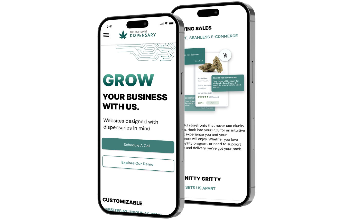
A landing page for a digital marketing startup aimed at the legal cannabis industry.
Services
- UX Design
- UI Design
- Frontend Development
Team
- 1 Founder
- 2 Stakeholders
Product
- Responsive Web
The Challenge
The Software Dispensary is a digital marketing company aimed at the the legal cannabis industry. Their existing website needed some TLC to make it suitably modern and professional. Created when the company was first formed, it no longer fit the branding in aesthetics or message. The main concerns were the lack of attention drawn to the product itself in the existing stock visuals, and the low visibility of the contact form and demo site links, intended to drive sales.
TL;DR - The Goals
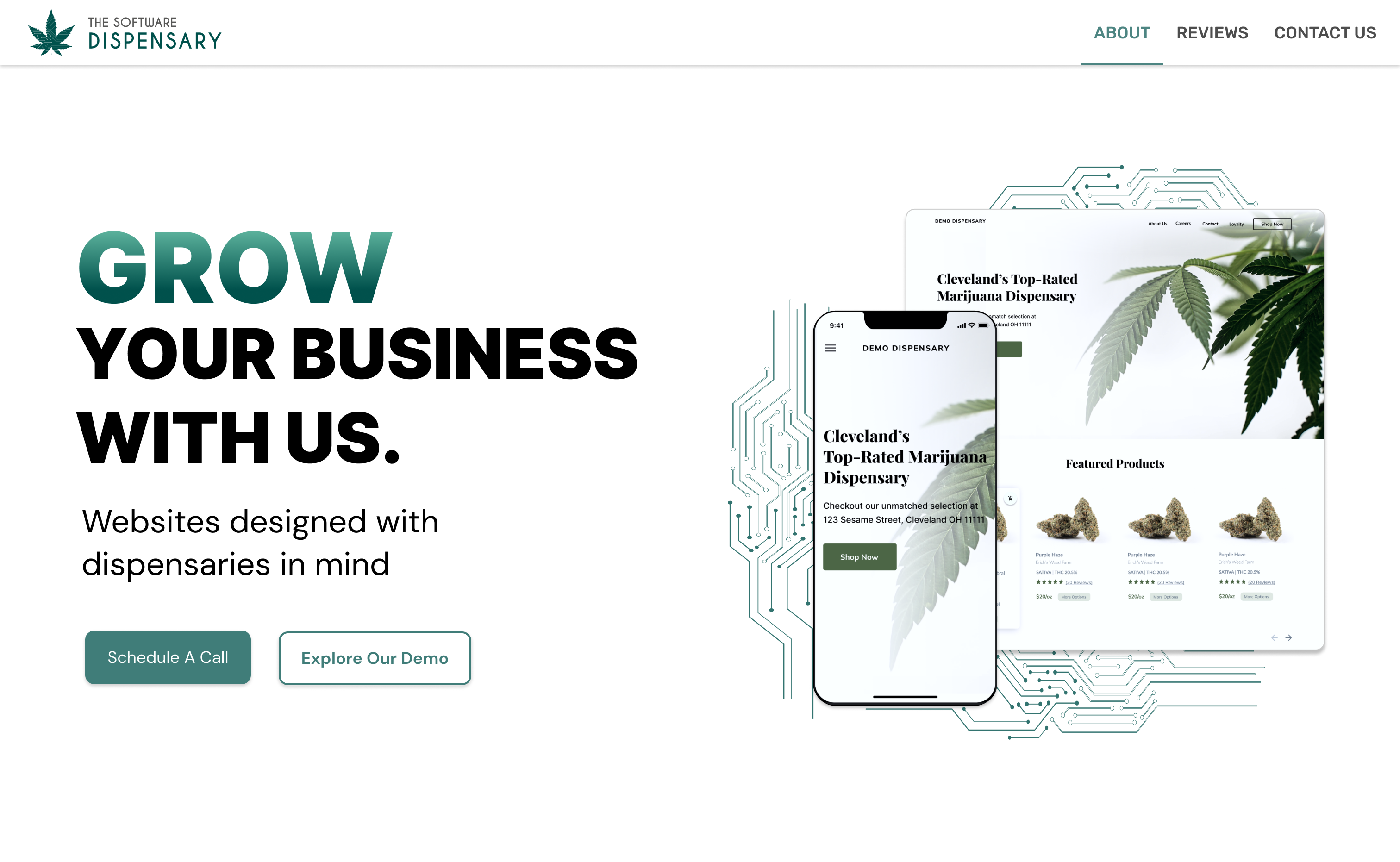
- Create a website to fit the brand: modern, simple, “just techie enough to seem like an authority while still being approachable.”
- Communicate the product and main audience without too many gimmicks.
- Draw more attention to the contact form and demo site.
Fitting The Brand
Modern. Techie. Fun & Approachable. The perfect combination for a contemporary tech company appealing to small business owners.
Key decision:
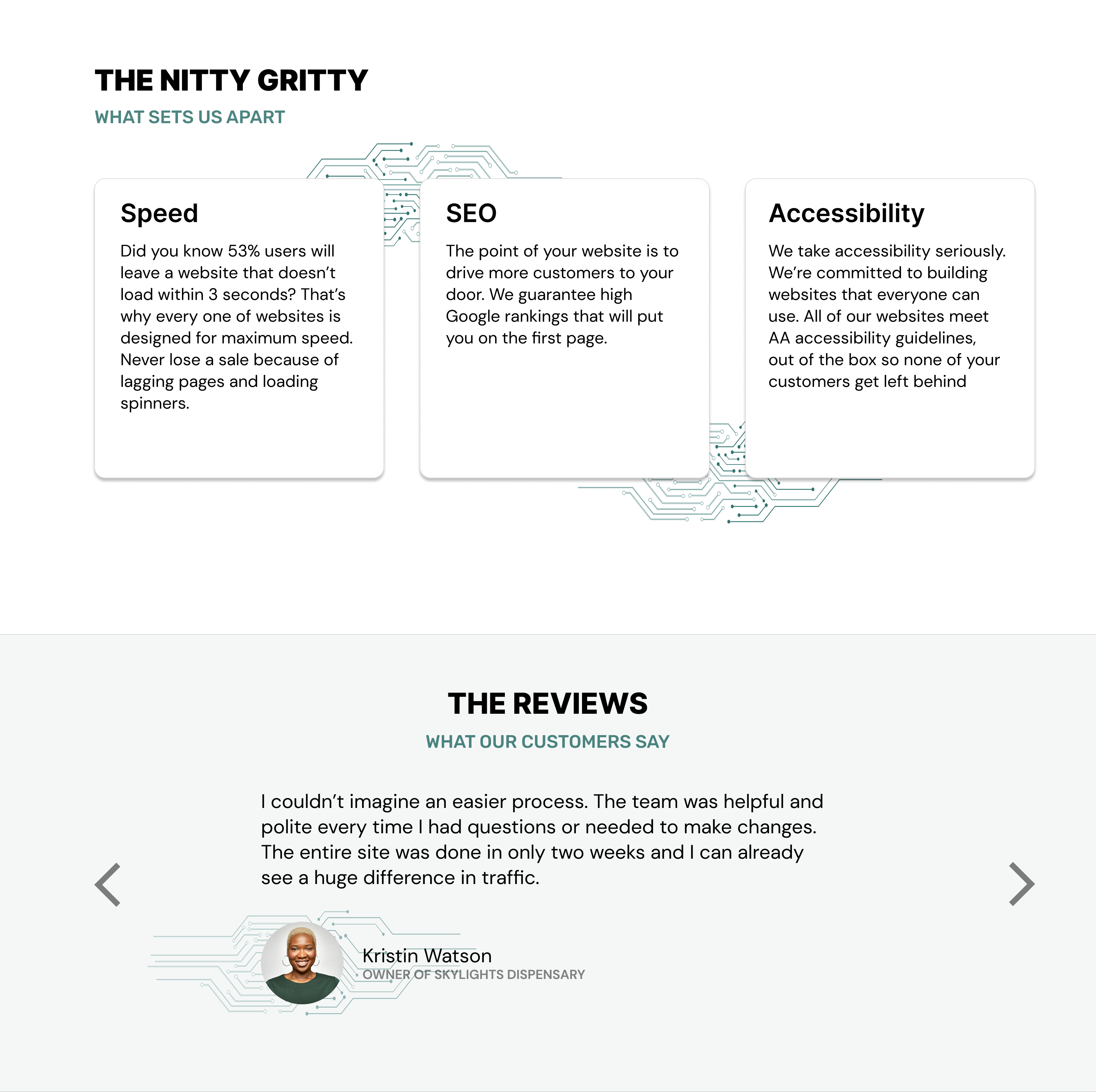
- Imagery - Repetition of circuitry panels, reminiscent of the company logo to keep the techie vibe present throughout.
- Fonts - Combining the geometric Rubik for all-caps accents with the clean DM Sans and Inter to ride the fence between techie and friendly.
- Colors - Green accents throughout (variations of the primary brand color) as a nod to the product, while keeping it subtle and free of silly gimmicks.
Highlighting the Product
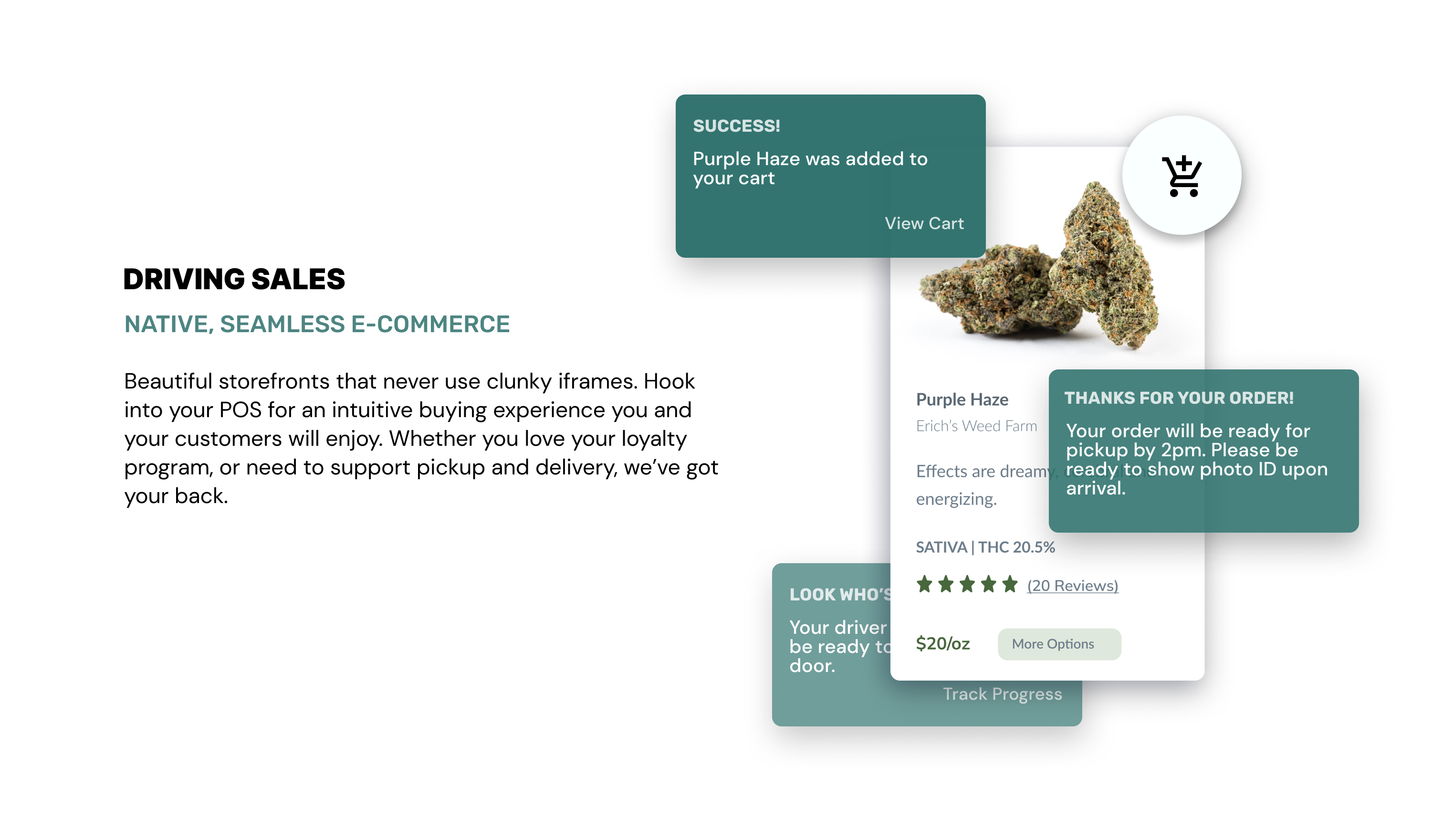
Why use stock imagery when you can let the product itself shine?
Key decision:
- Website Snapshots - Images of the application’s inventory module and homepage are prominently displayed.
- Demo Site - An additional call to action button directing future clients to a full-feature demo.
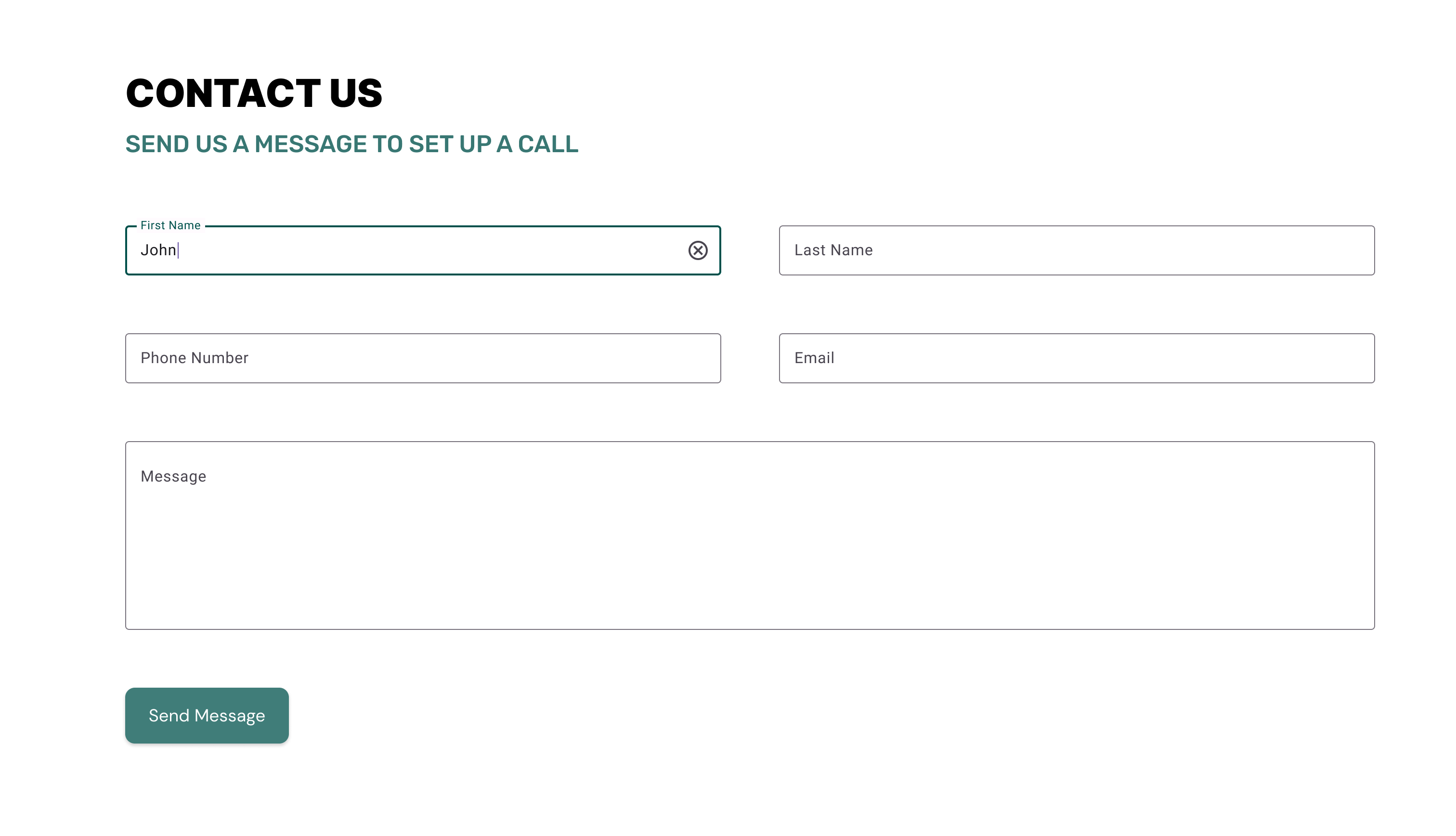
An Contact Form You Can’t Miss
Key decision:
- High-visibility call to action - Whether on mobile or desktop, the cta is the highest visibility button, displayed prominently in the primary green.
- Form on the homepage - Rather than hide the contact form on a separate page, clients will scroll to it directly on the homepage, making the process as simple as possible.
Responsive From The Start
By keeping the mobile and tablet design in mind from the start, I created a site that keeps the goals in mind at every size, sacrificing space but never the brand’s aesthetic.

Have a project you think would be a good fit? Let’s talk!