The Software Dispensary
A Content Management System for configuring client websites and managing user data.
Services
- UX Design
- UI Design
Team
- 1 Founder
- 1 Backend Developer
- 1 Frontend Developer
Product
- Responsive Web
The Challenge
TL;DR - The Goals
- Design an scalable application to manage client’s and their websites, equally suited for beta and full launch.
- Keep in line with brand aesthetic established by the company’s website.
- Design for different levels of access, including internal and external users.
Escaping Tables
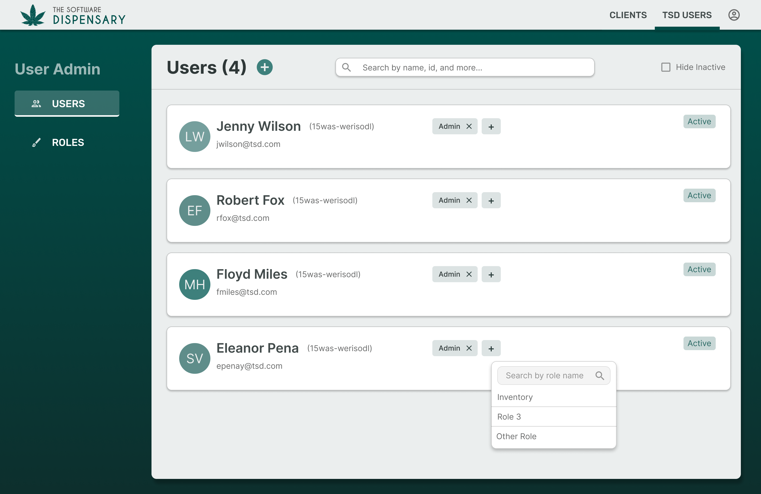
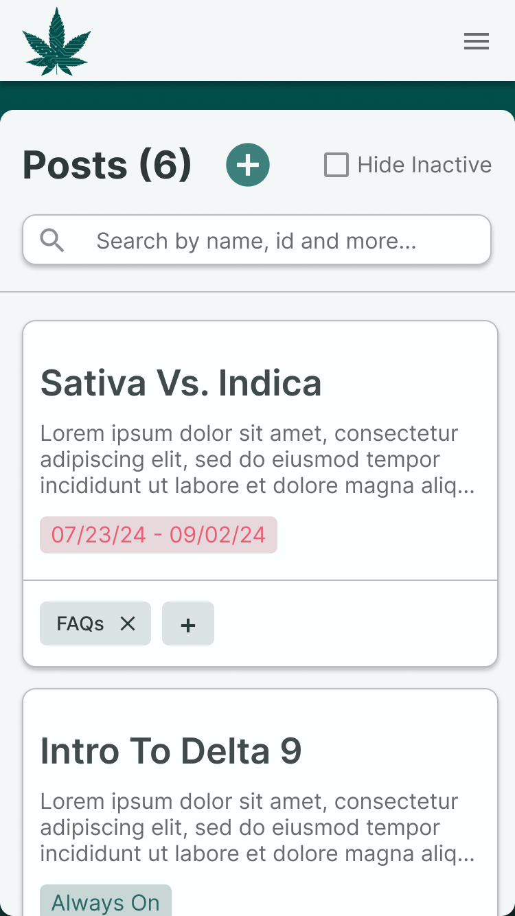
Websites may think in tables, but that doesn’t mean users do. By designing all lists in a card format, the pages are more responsive and easier to scan.
Key decision:
- Highlighting important fields - Most users decide what card to click based on name alone, making it the most visible field with other data supplementary.
- Quick Edits - Adding or removing roles, tags, and other common tasks accessible without entering the edit screen.
- Infinite Scroll - Most users find their record via search, meaning most records could be hidden until scroll to save unnecessary load time.
A Robust Search
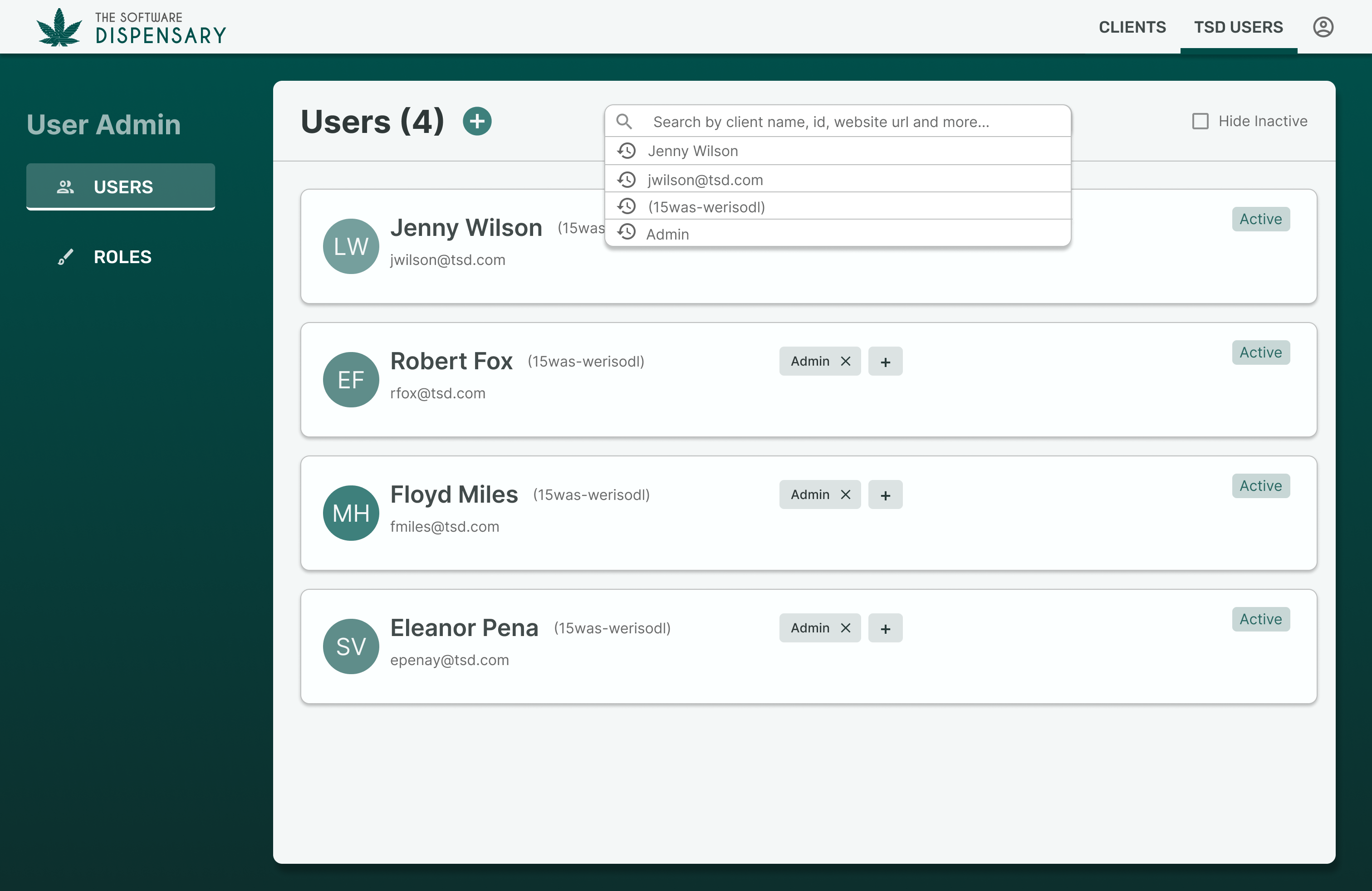
When getting new clients ready to launch, the faster, the better, and no one wants to spend any longer than they have to scrolling endless lists.
Key decision:
- Fuzzy Search - Gracefully allow for typos from internal staff and clients in a hurry to make their change.
- Recent Searches - When setting up a new client, the same search term may be used many times in a day. Making this easily accessible saves valuable time and frustration.
Dynamic Navigation
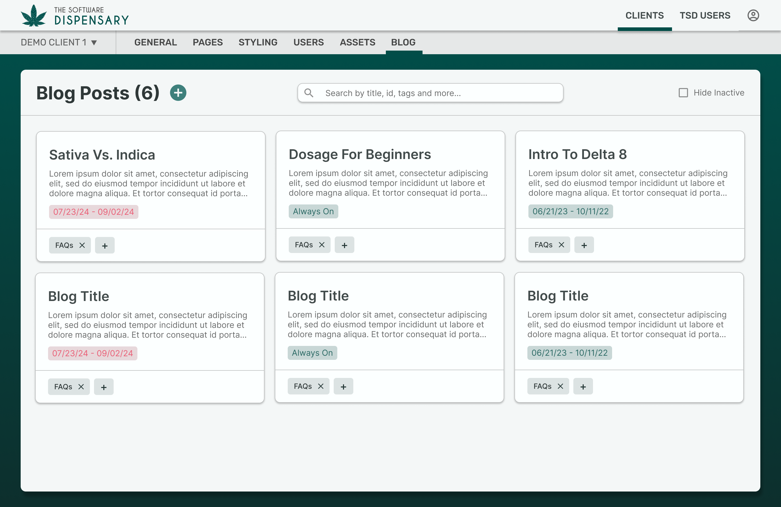
With the potential for internal and external users, all with varying access levels, the goal was to make the navigation as flexible as possible, maximizing screen real estate in all scenarios.
Key decision:
- Internal-Only items always visible - Internal access to client and user lists are separated from main navigation and always accessible.
- Built-in client switcher - Internal users are always able to switch clients without entering the client screen, speeding up workflows.
- Fixed top vs. side navigation - Main navigation categories are fixed to the top in a thin nav, and more granular options slide out from the side when necessary, utilizing full screen-width when possible.
Responsive From The Start
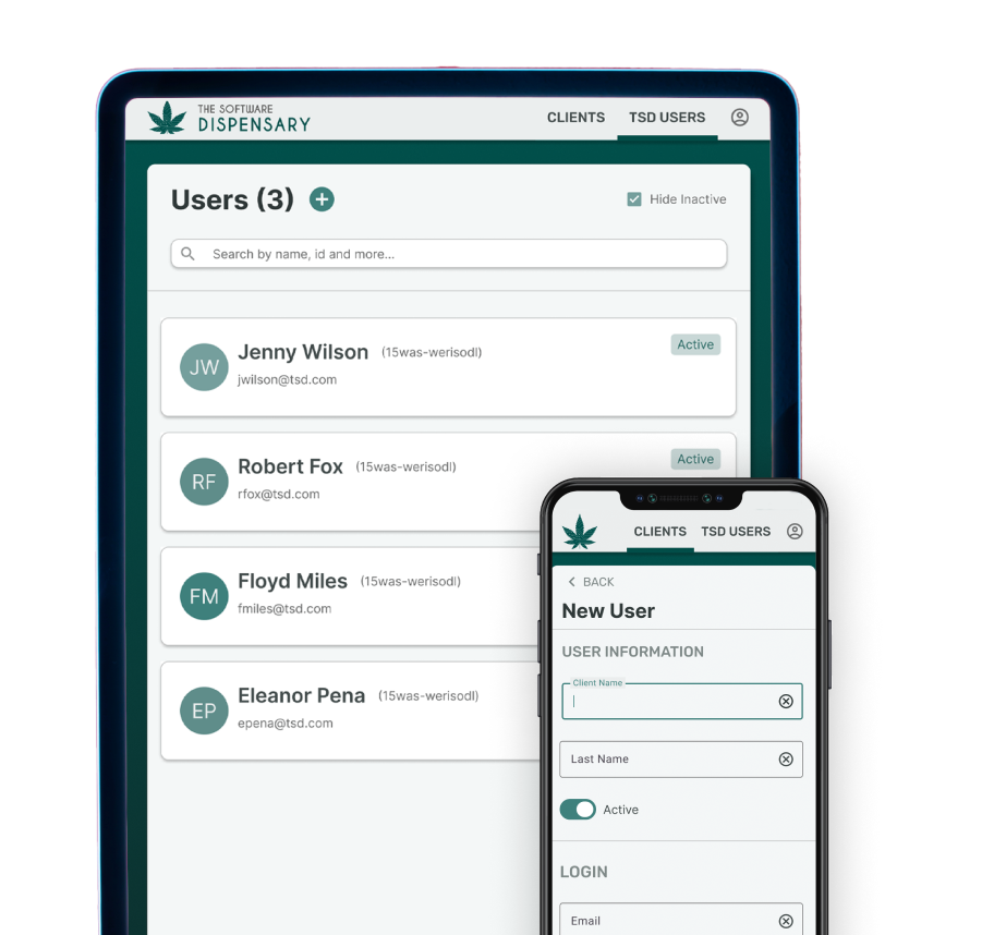
By keeping the mobile and tablet design in mind from the start, I designed the site to make sure no important data is lost, no matter how small the screen.
Developer Handoff
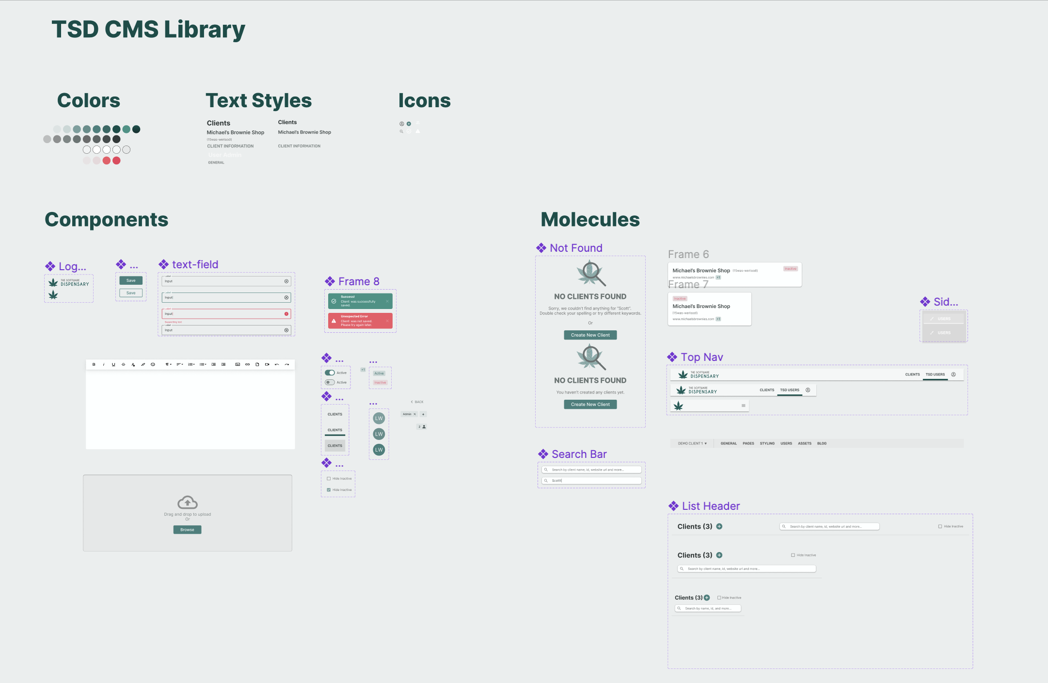
Using Figma’s built-in prototyping, library and component features, I make the developer handoff process as seamless as possible, defining common states, colors, and text styles up front so there’s no confusion how to tackle the markup and styling.
Have a project you think would be a good fit? Let’s talk!